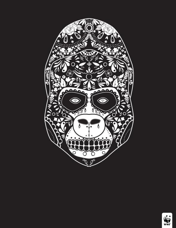
I like these for a few reasons. I like the style. There's an designer/illustrator here in Copenhagen, Tarik Arnautovic, who is pretty well known for his illustrations which are very similar, and I've always been fond of them. I also like the double entendre, and the play with the style of illustration. Finally, I like that they're so simple, and rely on the illustrations and the illustrations alone. But that's just me.


By Miami Ad School, illustrations by Justin Steinburg.
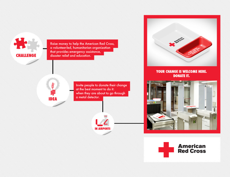
I love this idea from the Miami Ad School for the American Red Cross. Encouraging donations is an extremely hard job, and what better way to do it than when you have to take out your change anyway?

It reminds me a bit of the Danish donation system at supermarkets' bottle return systems. There, once you have returned all your bottles, you have a choice of either printing out a recipet which you can cash in at the check out, or you can press the other button which donates the money to charity. Really quite a good idea.
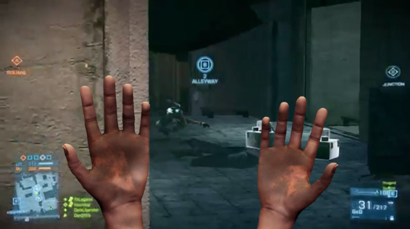
The students at the Miami Ad School created an update for Battlefield 3 that sends you into one game unarmed, thereby allowing you to experience life as a child in a war zone. I think it's pretty effective.
