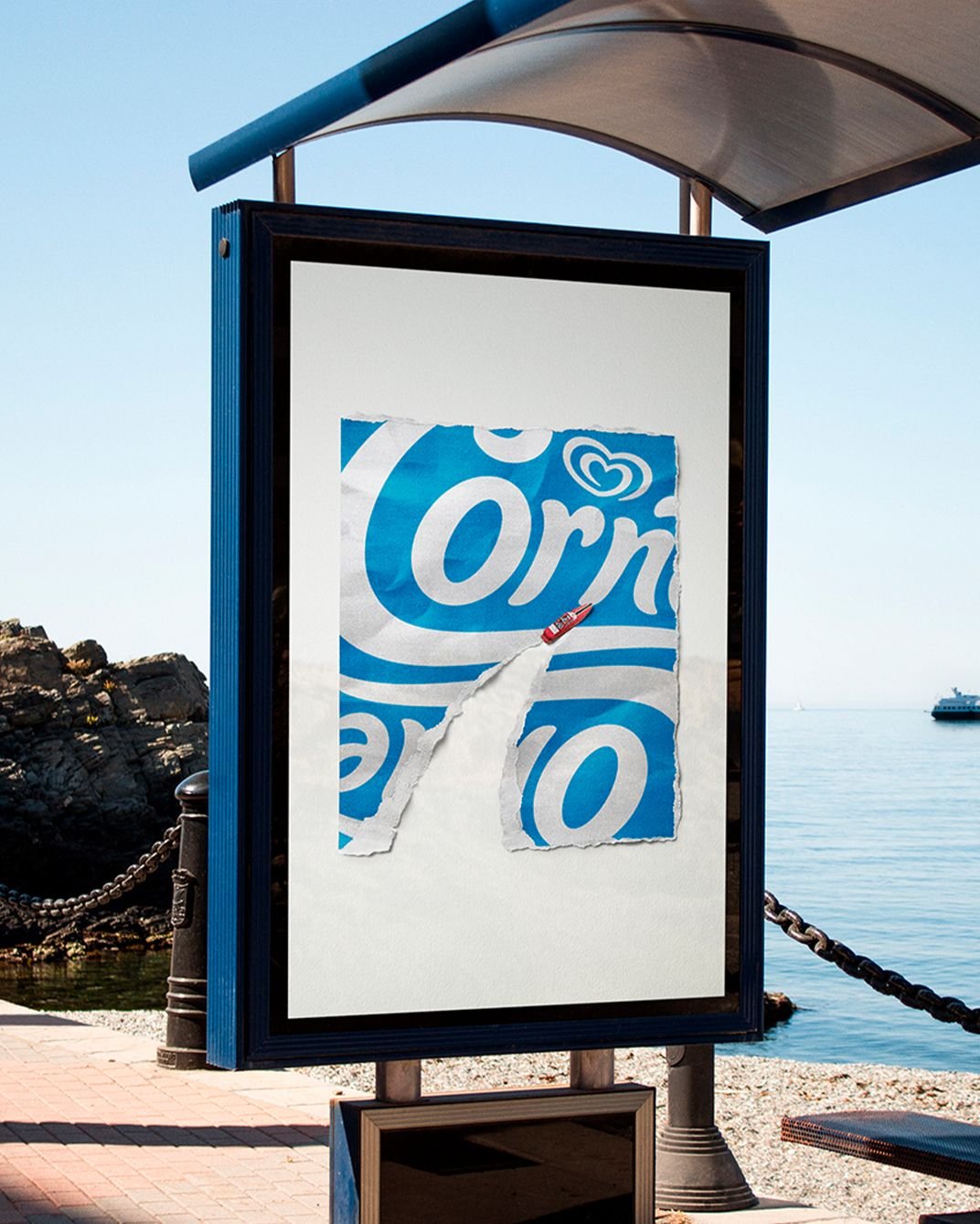
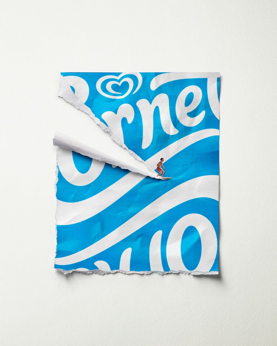
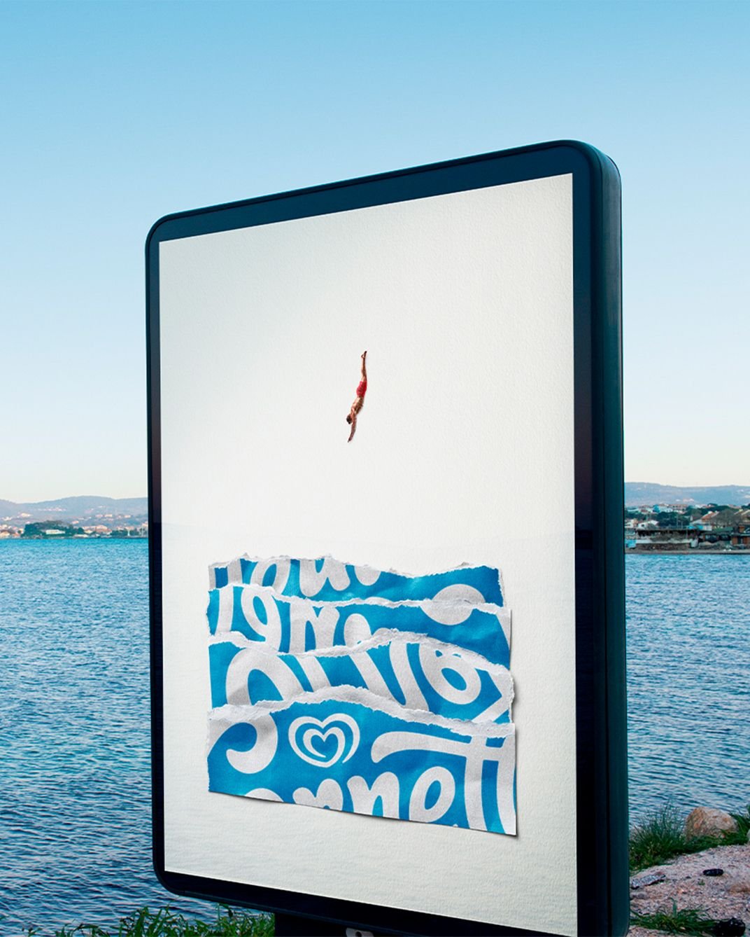
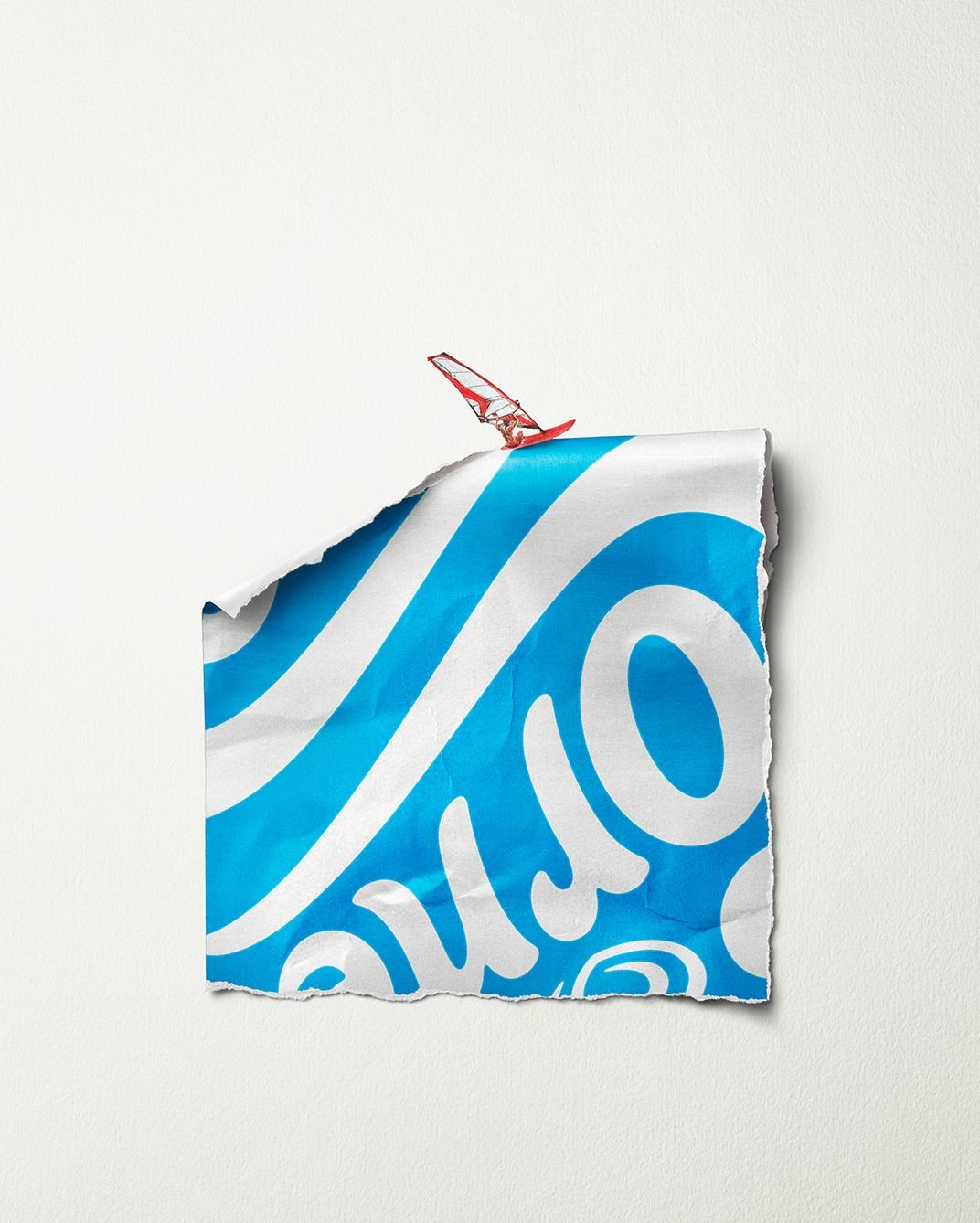
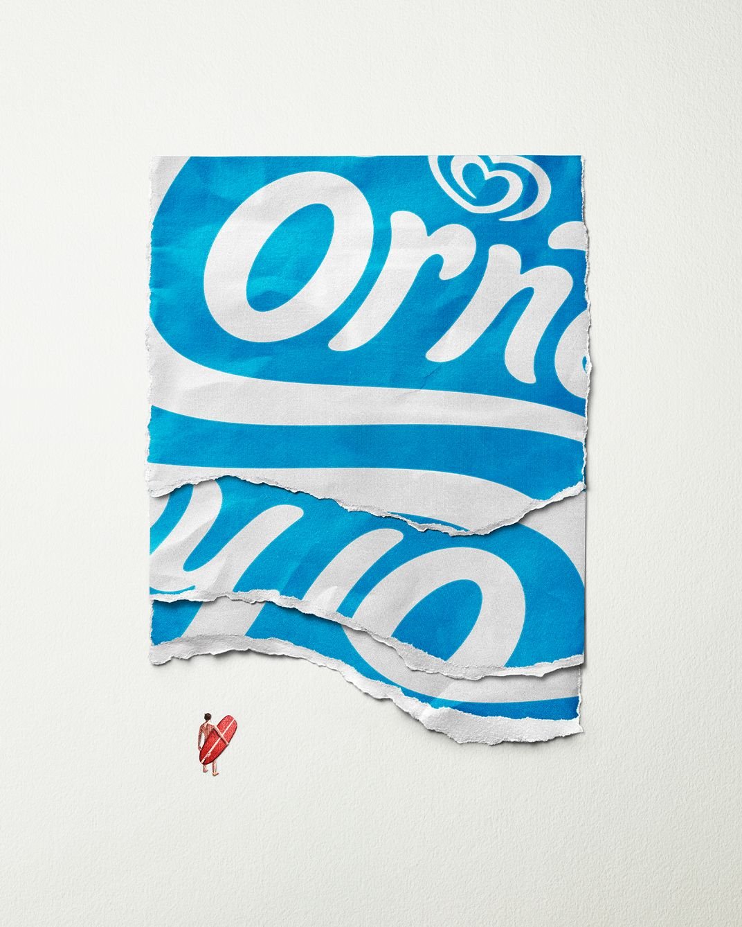
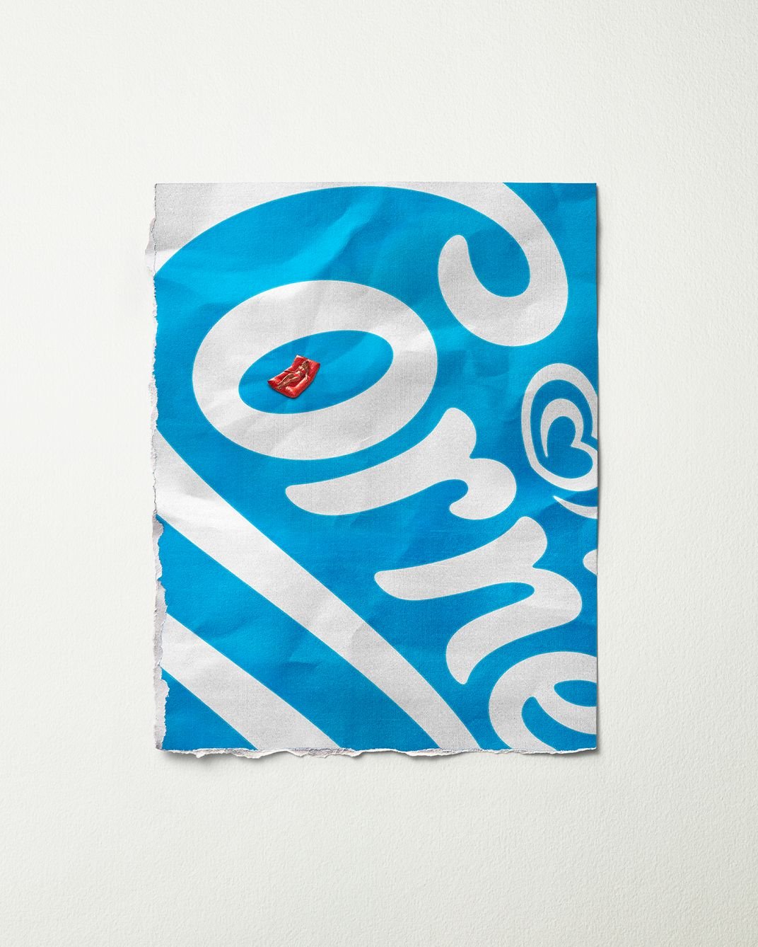
I love they’ve used the torn paper as the key element in these ads. I’d argue (without thinking about it too much beforehand which is essentially my modus operadi) that the feel of tearing that paper is unique to Cornetto. Sure, there are other ice creams you need to tear paper off, but there is something about the paper on a Cornetto. Try it and tell me I’m wrong. Betting on that asset was a bold move but it’s one I can get behind 100%.
Who needs to show the product amirite?
By LOLA MullenLowe.
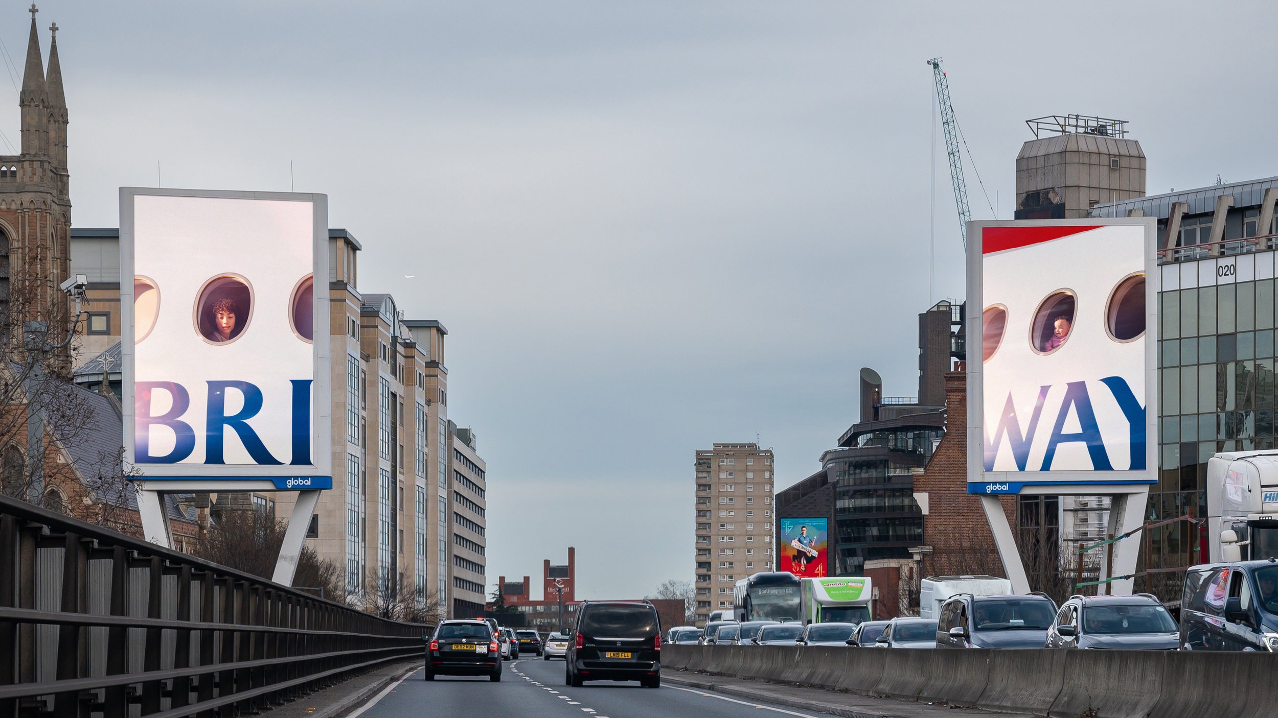
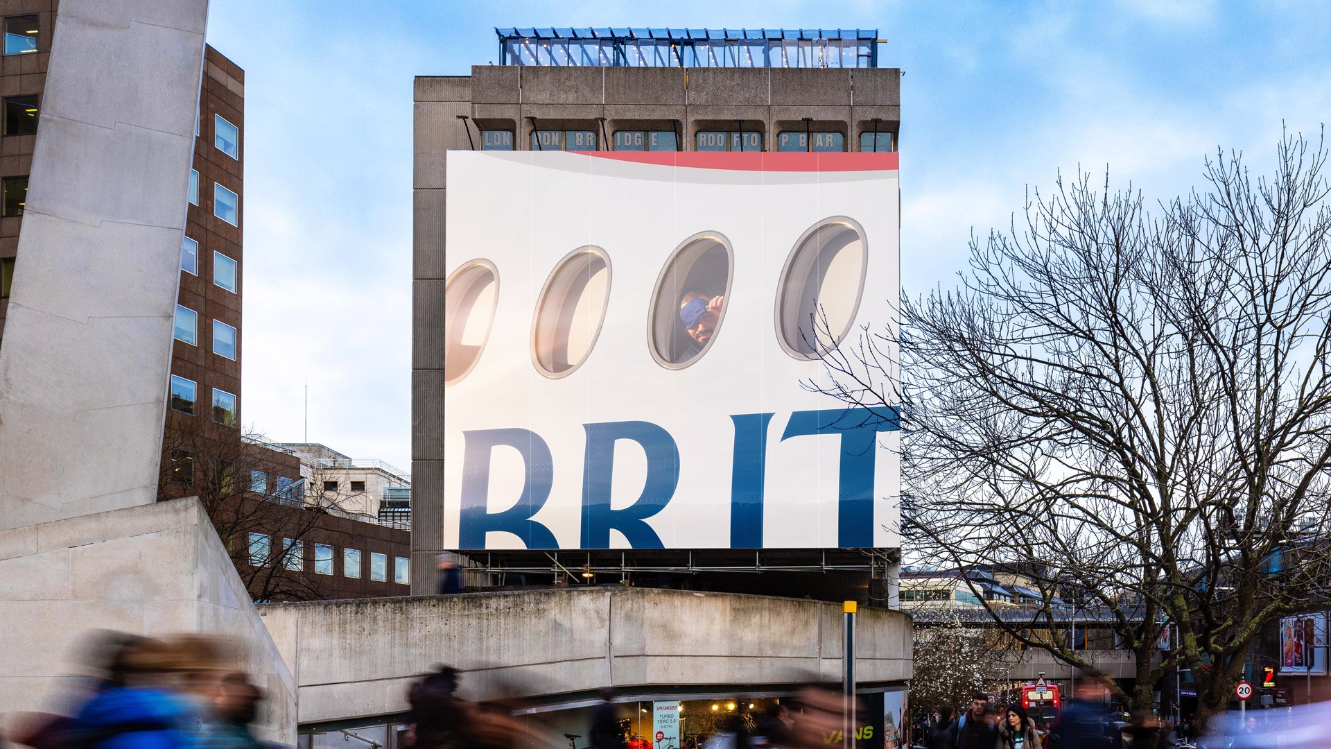
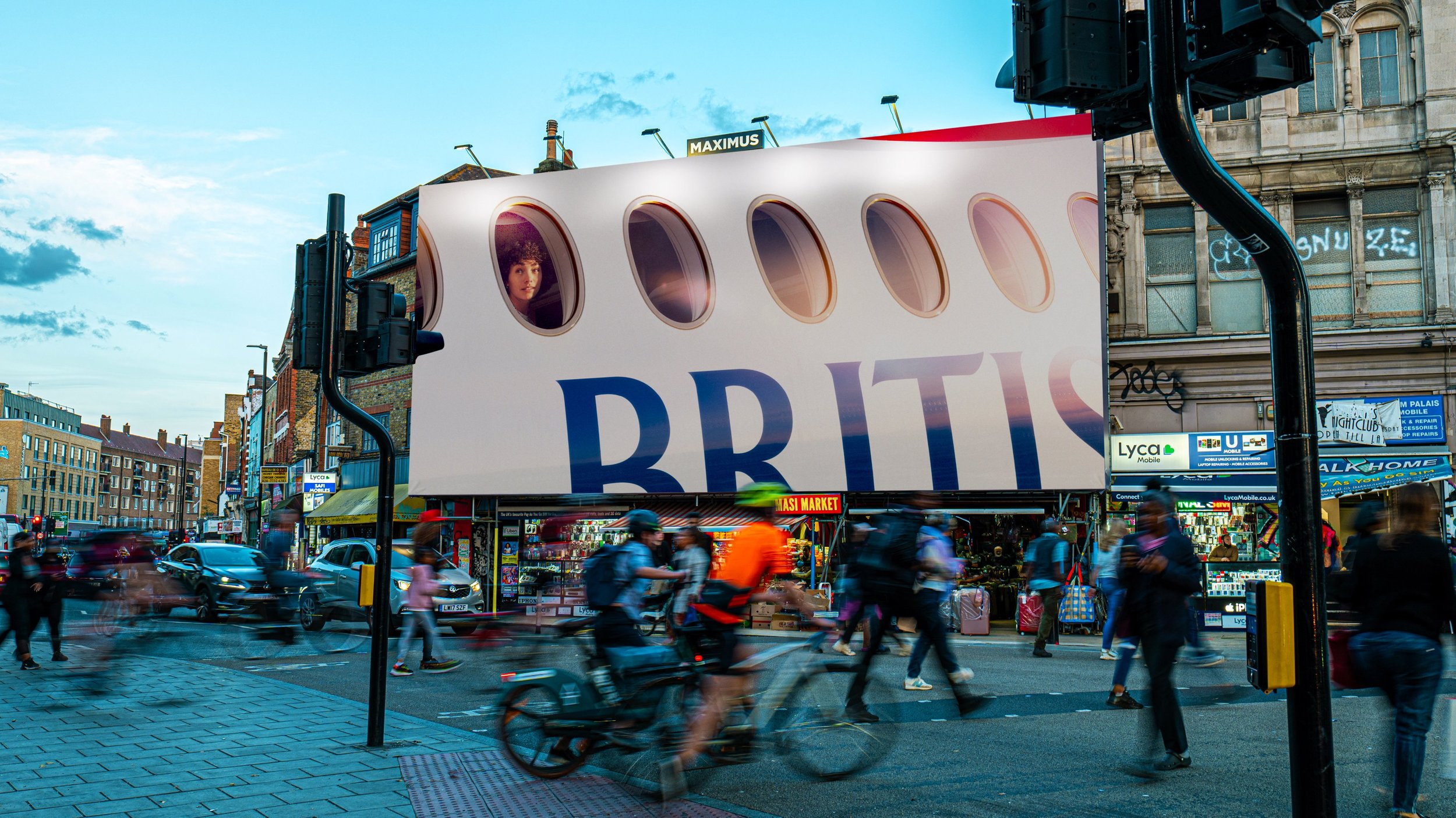
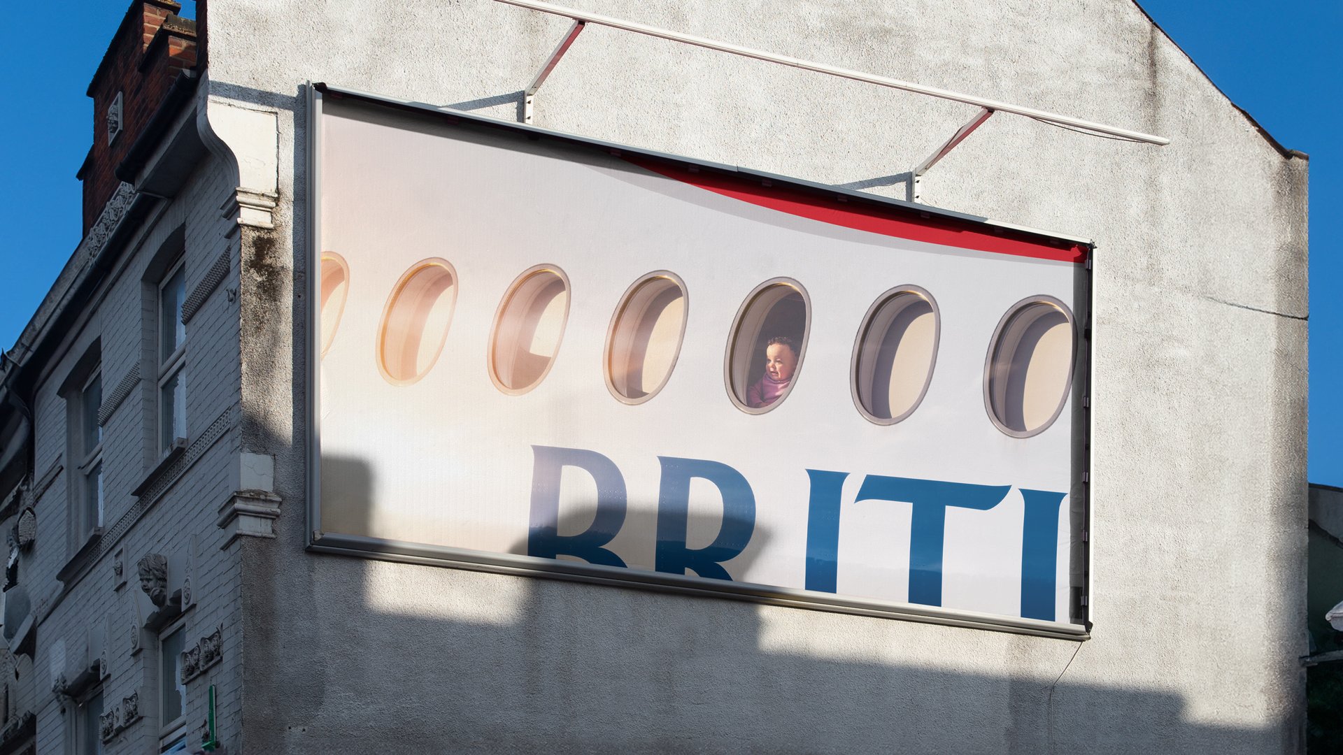
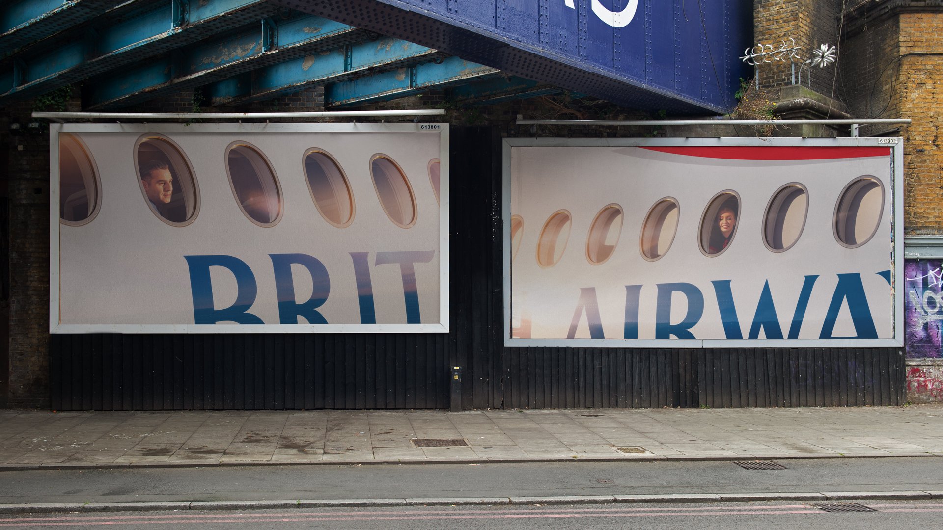
Love this campaign by Uncommon for British Airways. It’s a perfect example of how to use your brand when it’s so well-known you only need to hint at it and how to not clutter it with QR codes, URLs and other pesky things like words and CTAs.
Plus, the whole outside looking in instead of inside looking out is pretty neat too.
Unsurprisingly, it’s received its fair share of ‘this is shit’ over on LinkyDin, perhaps from those who are 100% performance folk given that the feedback is along the lines of “What does it tell me about travel?” and “Where’s the destination?” but they are missing the point as much as I’m missing St. Lucia which is where BA took me last year.
