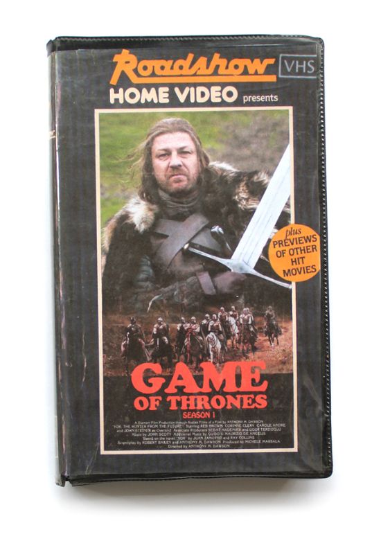
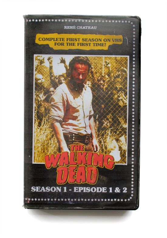
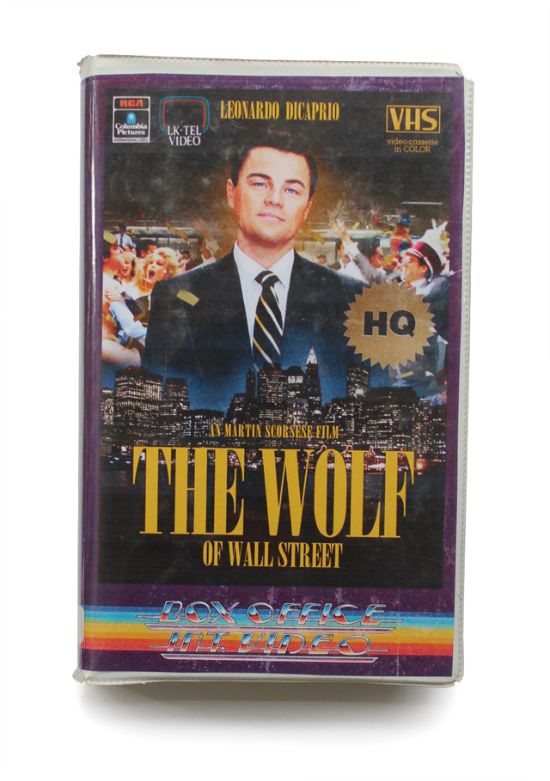
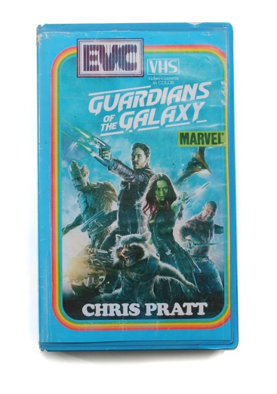
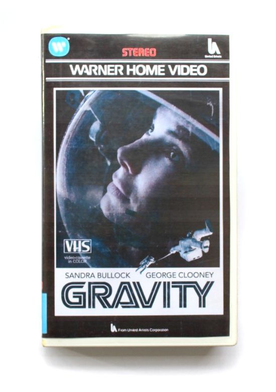
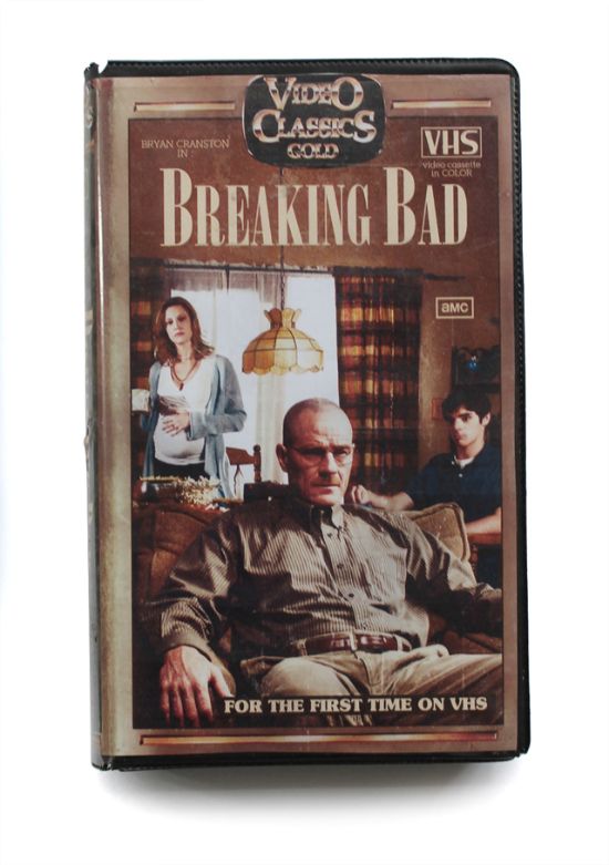
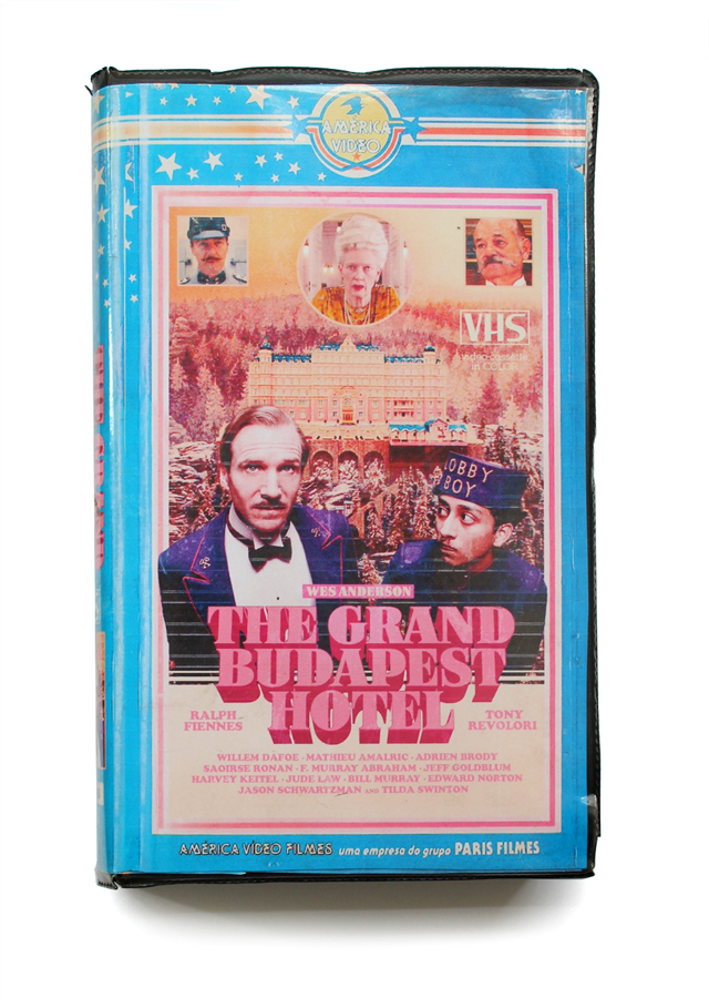
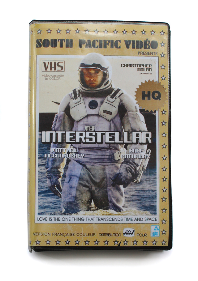
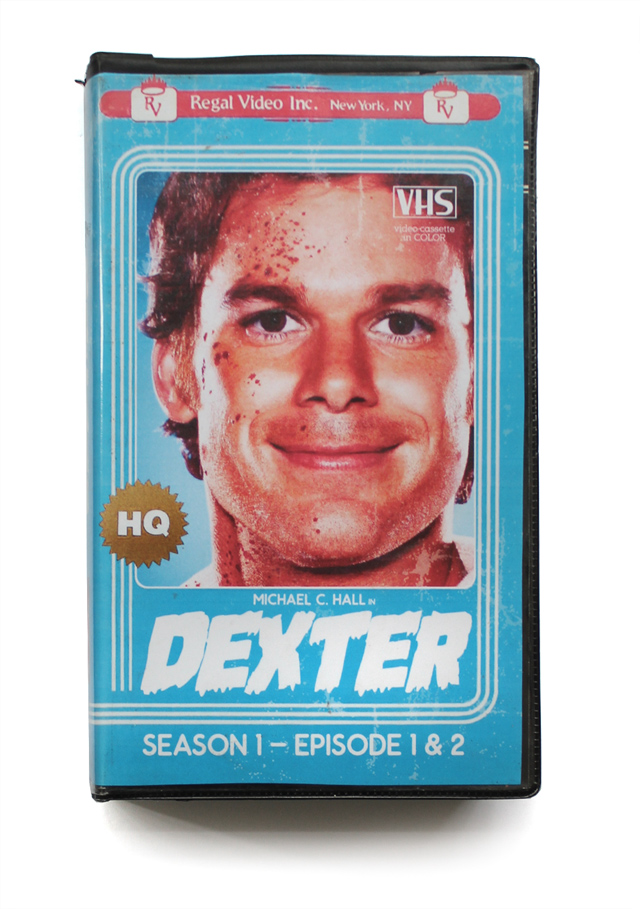
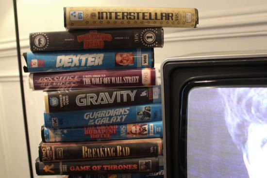
Modern VHS
Very well done. Makes me all nostalgic.
So the Olympics are over. At least, that's what we're told. Quite why the torch goes out and we have the closing ceremony before the Paralympics are played out, I'm not sure. Probably got something to do with tradition or something, but I think it's a shame.
Anyway, what a games it was. I've never felt more proud to be British. I deeply, deeply regret not being in the UK for any of the events, but honestly, I thought it would be a shambles. How wrong I was. Oh to have been in the stadium for that Saturday.
One of the stranger things was that I became rather fond of the 2012 logo and font. I really, really disliked it when it was first shown, but having seen it in action, as it were, I think it was really rather good. It was different, and it stood out. Having seen the logo and font for Rio in 2016 (by Tatil), my beliefs are only confirmed. It's not that I don't like Rio's, it just doesn't strike me as very exciting, which is odd for a city such as Rio. I'm not sure what it is exactly, as it definitely looks nice. It just doesn't stir anything in me.

The Wolff Olins' designed logo was designed around energy and anarchy, two words that fit London perfectly. What they created was dissonance, again, a word that can sum up the chaos of the capital city. One of it's strengths, I believe, was that people talked about it from it's unveiling six years ago, and the talk is still going on. Many might still despise it, but I do think that a lot of people came around to it - the fact that London put one of the - if not the - greatest Olympics yet certainly helped.

I think Creative Review says it best, "Rio, on the other hand, seems to have gone too far in the other direction. If London is all bared teeth, Rio rolls over and wants us to tickle its tummy."
I certainly don't dislike the 2016 logo, and I certainly understand and see all the reasons for the colours, the playfulness and overall design, but then, maybe that's the problem? Maybe it shouldn't be quite so clear. I wonder if in 4 years we'll be discussing Rio's logo quite so fervently?
You can watch the story behind Rio's logo below.

