Interweb 16
Another week of baby stuff marred by shootings much closer to home this time. Miraculously, only three dead and five injured, but three and five too many.
Other things that happened this week were a jaunt to England to visit the grandparents (no screaming on the flights, thankfully!), and, no...that's it really. Oh wait, actually Photoshop turned 25 (!).
This "map of self-declared identity according to the 2011 Census: how English and/or British is each local authority?" is wonderful (see here for a much, much larger version). I've alway considered myself more British than English, having a strong link to Scotland, and a surname stemming from Ireland (not much to do with Wales, mind you). It's interesting to see the odd patches of Britishness around the country, as well as the very high rate in London. I'd have actually thought it would be the opposite, but there you go.
The biggest film news this week (if you look away from the Oscars coming up), is that a new Alien movie is in the pipeline - officially! Directed by Neill Blomkamp of District 9 (I just found out he's a year younger than me. I'm so old), the final film can't be any worse than Alien: Resurrection - even the usually resplendent Sigourney couldn't save that. Or can it? We'll have to wait and see.
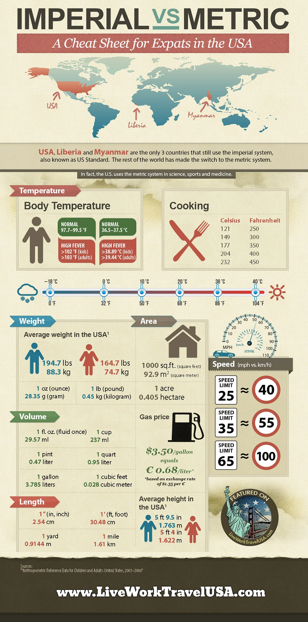
Anyway, to travel stuff, because why not. America, Liberia, and Myanmar are the only three countries that still use the imperial system. Go figure. If you're an expat or travelling there, here's a handy guide to help you out. Silly Americans.
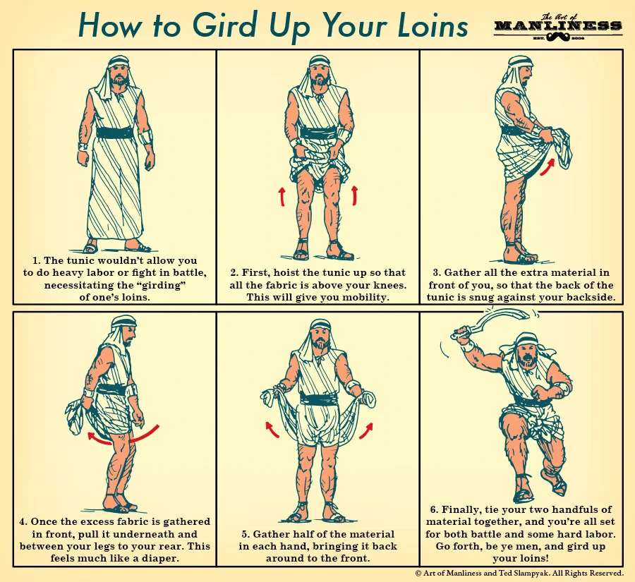
Gird your loins. Bet you never knew that!
From loins to chemical reactions.
Maybe I should have put Jesus and his marketing team before the chemical reactions. Loins go much better with Jesus. Anyway, too late.
Occasionally I notice a Wilhelm Scream in a film, but I'll willingly admit I've missed most of these.
And for your weekly dose of space (actually, that was something else that happened this week. This photo of us, the earth, turned 25 too. "Pale Blue Dot is a photograph of planet Earth taken on February 14, 1990, by the Voyager 1 space probe from a record distance of about 6 billion kilometres (3.7 billion miles)." Now sit back, close your eyes, and listen.
Have a great weekend. Be kind to one another.

